Hi Everyone! Who’s in the mood for a dreamy kitchen mood board? If you answered yes to that question, you’re in the right place (If you answered no, stick around anyways and maybe you’ll change your mood). A friend of mine is embarking on a kitchen update in her 1960s ranch and I’m pulling some ideas for her based on her tastes and wishlist. Mary, the homeowner, is looking to add some drama to her kitchen cabinets with emerald green paint, which will tie in nicely to her dark hardwood floors and stainless steel appliances. This inspiration photo caught our eye as we started to discuss her dream kitchen:
The inspiration photo above has a lot of the elements Mary described to me; emerald cabinets, marble countertops, light backsplash, and also has a dark wood tone on the island (similar to Mary’s floors). Mary’s kitchen style is transitional with a little bohemian mixed in. Come along with me as I share my ideas for paint, finishes, and fixtures, along with a few floor plan tweaks Mary is considering to make her cozy kitchen more efficient.

Mary’s kitchen is located at the back of her house and the current layout is about 8 feet by 11 feet. While there are no plans to remove any walls and expand the space to twice the size, there are a few changes that can make large impacts in making this small kitchen into a workhorse for a young family. Here are the parameters for the kitchen update (I’m calling this an update, because most of the cabinets and appliances are staying, so this is by no means a gut job):
- The fairly new appliances (& brand new range) will remain, with the refrigerator changing locations
- The cabinet boxes will be updated with paint and new cabinet doors (possibly some with glass!) will be made to match (most likely)
- Antique lighting fixtures Mary has will be installed
- The microwave will move to a different (built-in) location, so a freestanding vent hood can go in its place.
Floor Plan Changes
While the door leading from the garage to the kitchen is handy for grocery store trips, its less than ideal for the functionality of this kitchen the other 98% of the time. So, the plan is to move the door to the garage to a different location (most likely closer to the front of the house) and move the refrigerator to that space. This will allow for the refrigerator to become recessed in the wall (they can eat into the garage a few inches) so that the front of the refrigerator is flush with the edge of the countertop. This will save at least 8-10 inches of valuable floor space.
Now the question is what to do with the exterior wall where the refrigerator used to be. I’ve talked with Mary about two scenarios. The first option is to add floor to ceiling panty cabinets with a place for a built-in microwave. Since deep pantry cabinets can be overwhelming when trying to store things, I usually suggest going with 12-15 inch deep cabinets so all of your food items are easily accessible and so you can easily see what you have.

Because the pantry cabinets are narrow but span from floor to ceiling, this adds tons of extra storage without taking up much floor space and keeps the kitchen open to the dining area.
In option two, the cabinets next to the sink are extended and a peninsula is added. While this changes the flow of entering and exiting the kitchen (this space would become more narrow), it adds two more seating options in addition to the kitchen table. This option also allows for an extra window to be added to the exterior wall overlooking the backyard (just imagine the kids doing their homework at the peninsula with the light pouring in on their cute little faces).

With this option, the microwave could be mounted below the countertop in the new cabinets next to the sink, still allowing for a freestanding vent hood above the range. Both options have many benefits and add more functionality to this kitchen.
Paint, Finishes, and Fixtures
I’m calling this a transitional kitchen + a touch of bohemian.

As I mentioned above, Mary has recently updated her appliances with this LG refrigerator, GE Gas Range, and Bosch dishwasher (she raves about how quiet this dishwasher is while running), and she and her husband installed hardwood floors throughout the entire house soon after they moved in. Just to give you an idea of what a 1960s kitchen looks like, this is what the kitchen looked like when Mary bought her house in the early 2010s:

The cabinets, countertops and sink haven’t changed a bit but the appliances and floors are updated and the kitchen is already transforming.

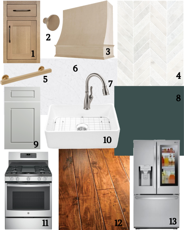
New doors will be made for the cabinets (Maybe in an inlay style like this or a raised panel style like this) and the cabinet boxes and doors will be painted a jewel-tone emerald green. Night Watch (PPG) is the color I choose for the mood board but here are a few other options that would look great as well:


And any of these colors would play nicely with the rich wood tones of the floor. It is yet to be decided if both the upper and lower cabinets will be painted in one of these emerald colors. The kitchen as is does not get a ton of natural light, so going dark on all of the cabinets might make the room feel smaller. Another option is to paint the lower cabinets in the jewel-tone green and then paint the upper cabinets in a creamy white. Once the final layout is picked, we will have more information to base our decision.
Since we are going dark with the cabinets and floors, I picked a white quartz countertop to lighten things up. Quartz is super durable and easy to maintain, making it great for families, and Mary’s original countertops are white with subtle (faux) veining which she really likes so I wanted to replace it with something of a similar look.
Another (super affordable) option for the countertops would be light colored butcher block, which would also pair nicely with the cabinet color and white backsplash.
To keep things light and airy, I choose a light colored backsplash as well. And since most of the walls are covered with cabinets, why not go with something fun?! The backsplash options I choose all have a bold pattern to add some interest to the space.
As for other elements in the kitchen, I choose to use mixed metals for some of the fixtures and hardware, and went with a large farmhouse sink (Mary prefers a sink with one large bowl over a divided sink with two bowls).
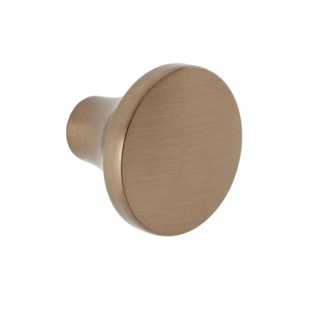
The farmhouse sink (another option here) adds a classic touch to the kitchen while mixing metals leans more modern and bohemian. When mixing metals, just make sure to repeat each tone several times so it looks intentional and thought out. The appliances and faucet are all a stainless steel finish while the cabinet pulls, cabinet knobs, and antique light fixtures (Mary has some stashed away that she has been waiting to use) all have an antique brass finish.
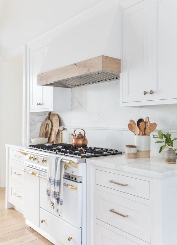
The small cabinet above the stove, along with the microwave will be removed to make way for a freestanding vent hood. I think this sloped range hood would be a great addition to the kitchen, either painted to match the cabinets or stained to match the wood tones in the room. Or, maybe even a combination of painted and stained like this inspiration photo:

A freestanding vent hood will really elevate the new range as the focal point of this kitchen. So, how do you feel about this transitional + a little bohemian kitchen mood board? I’ll definitely keep you posted on the progress of this project and let you know the final design picks.

Are you dreaming of a kitchen update? Whats your favorite style? I’d love to hear about your kitchen dreams and plans. Comment below or connect with me on instagram @elleandjaydesign.


I cannot wait to make this happen! Thanks to elle & jay, I’m so inspired to keep working with Hannah and have some after photos, even if it’s a bit down the road… ?